Why I Chose My Brand Colours: My Calgary Personal Assistant Brand

Building My Calgary Personal Assistant Brand With Intention From the Start
I started my personal assistant business in Calgary with a brand strategy already in place, and my colour palette was part of that foundation from the very beginning. Before I officially launched anything or took on my first client, I had already spent time thinking about how I wanted my business to feel and how I wanted it to be experienced.
For me, branding was never just about visuals. It was about emotion and perception. I wanted my Calgary personal assistant brand to communicate calm, clarity, and trust from the very first interaction. I wanted people to feel supported and confident that everything would be handled with care and structure.
That feeling became the foundation of my decisions. It shaped not only how I built my services, but also how I chose to visually represent my business.
As I developed the structure of my work, I kept returning to one central idea. My role as a personal assistant is to create clarity in the middle of complexity. I take busy schedules, mental overload, and constant demands, and turn them into something organized and manageable. Because of that, my brand needed to reflect the same approach.
It needed to feel simple, intentional, and grounded.
The Meaning Behind My Brand Colours: Black, White, and Grey
When I think about my Calgary personal assistant brand, I think about simplicity first. I did not want anything overly bold, distracting, or visually overwhelming. My clients already have full lives, full schedules, and full minds. I wanted my brand to feel like the opposite of that.
That is what led me to black, white, and grey as my core brand colours. Technically, these are neutral shades, but I refer to them as my brand colours for simplicity and consistency.
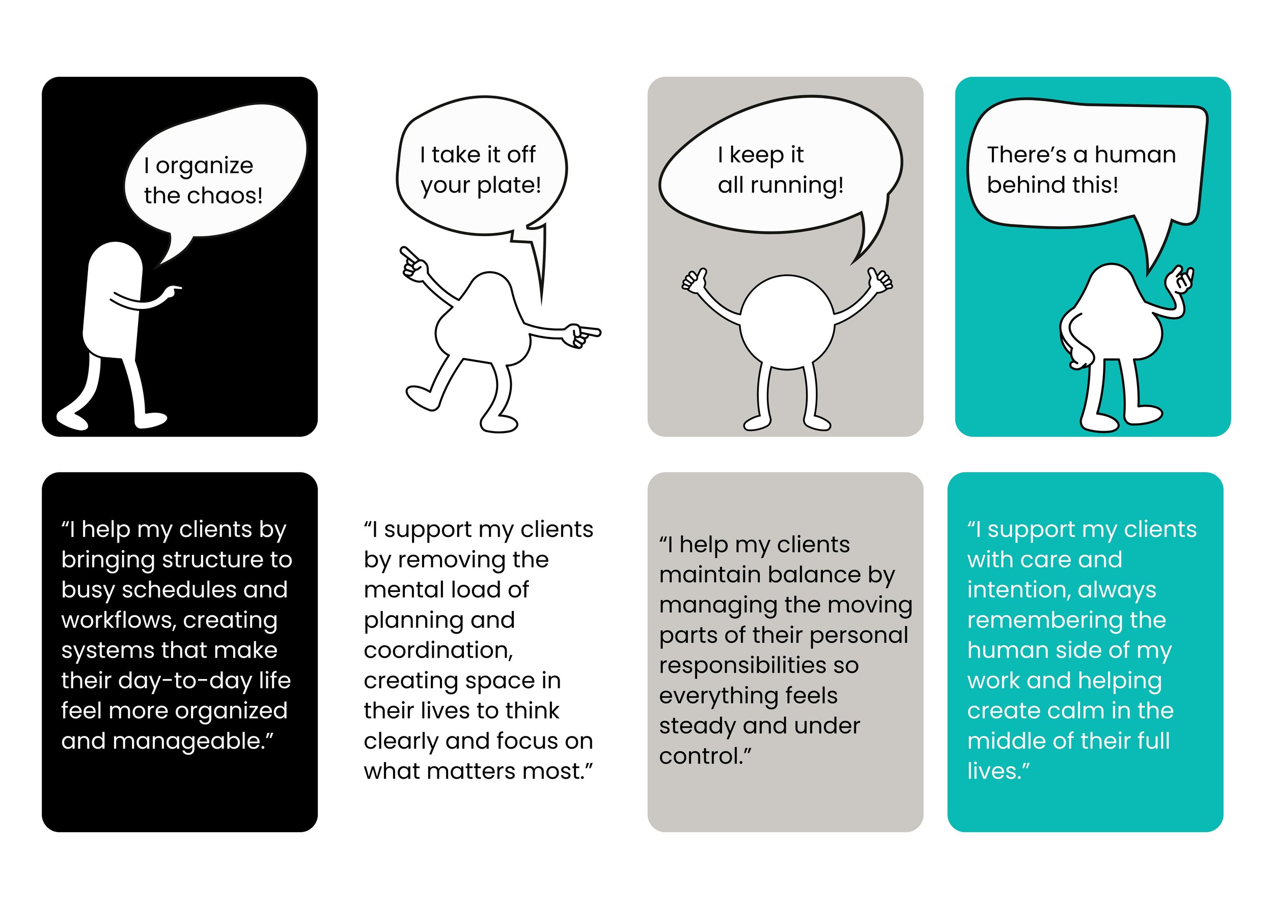
Black represents structure in my business. It reflects the systems and reliability that hold everything together when life feels chaotic or full.
White represents space. It is the pause between tasks, the clarity that comes when things are simplified, and the feeling of being able to breathe again.
Grey represents balance. It is the calm middle ground that helps everything feel steady and manageable, even when there is a lot happening at once.
Together, these colours reflect how I approach my work as a personal assistant in Calgary. I do not add noise or complexity. I reduce it. I simplify systems, organize details, and create structure that feels light rather than heavy.
Over time, I realized these colours were not just aesthetic choices. They were a visual extension of how I actually work.
The Story Behind Teal in My Calgary Personal Assistant Brand
While black, white, and grey form the foundation of my brand identity, there is one colour that carries a much deeper personal meaning for me, and that is teal.
Teal was never chosen for design reasons alone. It is personal in a way that is deeply connected to my life outside of business. Teal is my daughter’s name, and including it in my brand was intentional from the very beginning.
This decision was not about marketing or branding strategy. It was about meaning. It was about making sure my business always reflected the human side of who I am and why I do this work.
To me, teal represents heart, care, intention, and balance. It represents the part of my Calgary personal assistant business that cannot be measured in tasks or systems.
It is a reminder that behind every calendar I organize or every personal task I complete, there is a real person. Someone managing responsibilities, relationships, goals, and pressures that are not always visible on the surface.
Teal keeps that perspective at the center of everything I do.
It ensures that even in a structured, detail-oriented business, the human element is never lost.
The Human Side of Being a Personal Assistant in Calgary
Most people see the outcome of my work. They see organized schedules, completed tasks, inboxes that feel more manageable, and systems that run more smoothly. What they do not always see is what exists before that clarity is created.
There is often overwhelm. There is often mental load. There is often a long list of invisible tasks that take up space in someone’s mind long before I step in to help.
My role as a personal assistant in Calgary is to take some of that weight and turn it into structure. Not rigid structure, but supportive structure. The kind that creates breathing room instead of pressure.
That means creating space where there was none before.
Space to think clearly.
Space to focus on priorities.
Space to step away from constant mental juggling.
This is one of the most important parts of my work, and it is also what shaped my brand identity the most. Because my business is not just about productivity. It is about creating ease in people’s lives in a very real and practical way.
How My Brand Colours Reflect My Business Values
Over time, I came to understand that my brand colours are not just part of my visual identity. They are a reflection of the values that guide my Calgary personal assistant business every day.
I believe in structure that allows flexibility, because life is never perfectly linear. I believe in professionalism that still feels human, because support should never feel cold or disconnected. I believe in offering help that goes beyond tasks and systems, because real support considers the whole person, not just the to-do list.
Structure that allows flexibility
Professionalism that still feels human
Support that goes beyond tasks and systems
These values were not added later in my journey. They were part of the foundation from the beginning, and they continue to guide the way I work with every client I support.
Final Thoughts on My Calgary Personal Assistant Brand Identity
I did not choose my brand colours to create a certain image or aesthetic. I chose them because they already reflected the kind of work I knew I wanted to do and the kind of experience I wanted to create.
My Calgary personal assistant brand is built on clarity, calm, and intention. Every colour in my identity represents a piece of that foundation, from structure and simplicity to care and personal meaning.
Every time I look at my brand, I am reminded that this business is not only about organization, productivity, or systems. It is about people. It is about creating calm where there was once too much noise, and helping clients feel more supported in their everyday lives.
That is still what I am building, one client, one task, and one moment of clarity at a time.